Friday, April 29, 2016

Weekly Roundup #12

Every Friday, we're taking a look at the film and television posters released over the past week. Enjoy! 
The stars, film title and tagline would indicate that this is your everyday paranoia-thriller, but the colorful hues – and Stephen King's mention, of course – suggest that Cell will be something more. 
Captain Fantastic: the name of a reject superhero and a poster that will seriously trick you into thinking this is a Wes Anderson film. 
Nothing about these posters tell you what the movie is really about, but they showcase the film's beautiful animation through a series of differing – and intriguing – environments. 
You know it's not a very creative poster when there's nothing to indicate that the filmmakers didn't just take an unused poster from the predecessor and stick some different text on it.  

Which poster is your favorite? Tell me in the comments, and feel free to subscribe.

Wednesday, April 27, 2016

Spotlight: "Keanu"

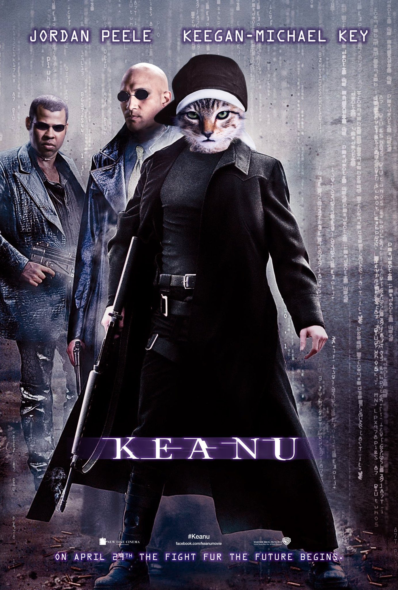
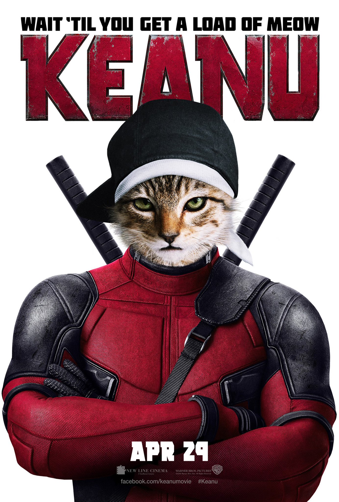
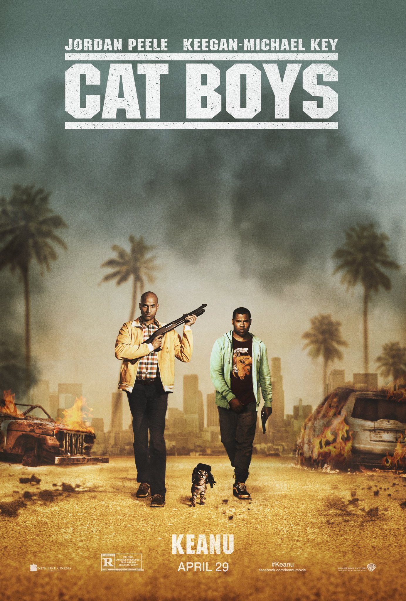
Key and Peele's action-comedy Keanu, about two friends posing as drug dealers to retrieve a stolen kitten, is opening this Friday. The film's marketing campaign has consisted of a string of hilarious cat-themed parody posters:
The other little joke here is that The Matrix, the film this poster is parodying, starred Keanu's namesake (who also voices the titular cat).


Which parody poster is your favorite? Tell me in the comments, and feel free to subscribe.

Friday, April 22, 2016

Weekly Roundup #11

Every Friday, we're taking a look at the film and television posters released over the past week. Enjoy! 
The colors hint show the vibrancy of jazz and the interior words give us a hint at Davis' own personality, even if they're a little hard to read.
If you're going to make a rather unnecessary sequel, you might as well tease the film's "magical" nature with its full deck of star power. 
All hail IMAX. Who needs photoshop when you can go with realistic, comic book-style art? 
Vin Diesel first shared this with the caption, "This fan art poster is pretty intense... Your creativity inspires." Sorry, but there's nothing creative about this; you're just slapping a filter onto an old Fast and Furious image and adding a automotive-themed tagline. It's a pity that Mr. Diesel has legitimized this as Furious 8's official poster. At least it's a step away from the franchise's previous posters, which have consisted of macho guys and hot girls posing with cars and guns and other generic action movie stuff.

Which poster is your favorite? Tell me in the comments, and feel free to subscribe.
Friday, April 15, 2016

Weekly Roundup #10

Every Friday, we're taking a look at the film and television posters released over the past week. Enjoy! 
If you need any proof that IMAX posters are the secret treasures of this world, look no further. There are enough superheroes here that one could mistake this for Avengers film, if not for the orbiting rings of Captain America's shield. 
To accompany the release of its first trailer, this poster hints at the film's colorful weirdness while showcasing its A-list star. 
Once again, X-Men: Apocalypse's poster campaign deserves a resounding "meh." Don't get me wrong, each one of these young, attractive mutants in their vaguely symmetrical poses look good, but it's really nothing more than the generic superhero movie poster.  
The comic book styles are admirable on their own, but the fake video game ESRB rating in the bottom left corner adds a whole new dimension (especially when you see Patrick Stewart listed among "Bloody Violence" and "Strong Language" as a justification of the film's rating). 

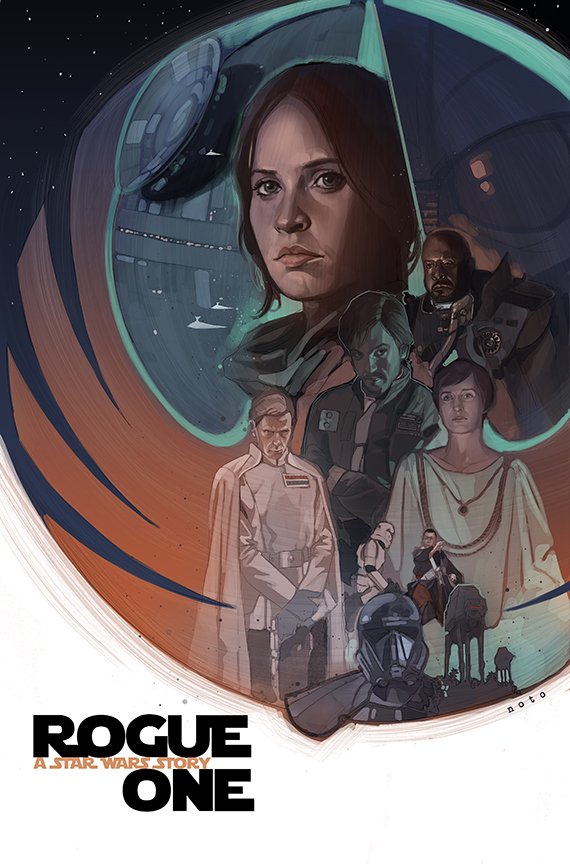
Designed by comic book artist Phil Noto, this is a perfect example of the Trailer Poster: a poster composed exclusively of imagery from the first teaser trailer for the film. (The Force Awakens had its own share of Trailer Posters.) 

Which poster is your favorite? Tell me in the comments, and feel free to subscribe. 

Friday, April 8, 2016

Weekly Roundup #9

Every Friday, we're taking a look at the film and television posters released over the past week. Enjoy! 
It has the name of a Jason Statham movie and the poster of...something unique. 

Rogue One will undoubtedly receive a jam-packed, Drew Struzan-esque, Star Wars-style poster later in the year, but as a minimalist teaser poster, this does a pretty good job. The tagline even references Episode IV: A New Hope, which chronologically takes place after Rogue One (a fact that many may have been unaware of). 
You generally wouldn't expect even a teaser poster to arrive so early in a film's production, but it's clear that the filmmakers are making a point by hinting at the return of Colin Firth's deceased(?) character. 
Interestingly, this poster opts for an artistic style, as if a traditional artist (rather than a team of photoshoppers) sat down and made this. Another interesting choice is that the opposing, mirroring faces at the top vaguely resemble the Civil War poster.

Which poster is your favorite? Tell me in the comments, and feel free to subscribe. 

Friday, April 1, 2016

Weekly Roundup #8

Every Friday, we're taking a look at the film and television posters released over the past week. Enjoy! 
Posters, unlike trailers, are generally intended to be placed in public locations, so they can't show the films' scary antagonists. Lights Out follows the common trend of conveying a sense of creepiness with a seemingly-innocent image. 
Yes, everything about an Angry Birds movie is stupid, but at least its posters can take advantage of holidays. 
I understand that these movies are supposed to be weird and colorful, but Alice Through the Looking Glass might be getting lost in its own eccentricity. 

Spy thrillers with B-list European casts are pretty common these days, but Our Kind of Traitor attempts to distinguish itself with some interesting geometric shapes. 

Which poster is your favorite? Tell me in the comments, and feel free to subscribe.