Friday, June 24, 2016

Weekly Roundup #20

Every Friday, we're taking a look at the film and television posters released over the past week. Enjoy! 
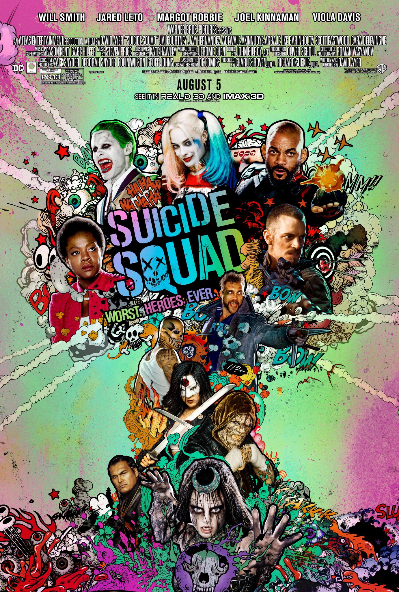
Between the ensemble cast and variety of colorful, comic book-like effects, this poster sure is cluttered. It's hard to tell if this is an appropriate presentation of the film's chaotic tone, or just annoying to the eyes.
Grade: B
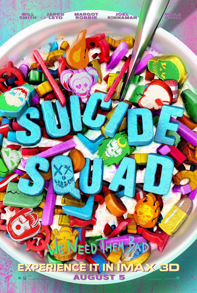
This poster, on the other hand, perfectly captures the film's impressive cast of characters and bizarre theme without overwhelming the viewer.
Grade: A-
For a movie called Fantastic Beasts, you'd think that they could have come up with something a little more interesting for the poster. Let's just hope that this isn't the final one. 
Will this movie be good? Probably not, but this is still a pretty well-made and effective teaser poster. 
Grade: A-

Which poster is your favorite? Tell me in the comments, and feel free to subscribe. 
Friday, June 17, 2016

Weekly Roundup #19

Every Friday, we're taking a look at the film and television posters released over the past week. Enjoy! 
 
You can't really blame the designer for using bikini-clad Blake Lively on their poster (it seems like she is scantily clad for most of the film, so it's actually appropriate). But you can blame the designer for this poor photoshop job; her midsection makes her look like a zombie, and her right arm is just awkwardly dangling. 
Grade: C 
I've never heard of this show before. This poster doesn't help. Oh well, at least it looks pretty. 
Grade: B
You can't really tell what this film is about, but the poster evokes a sinister tone in a rather artistic style. 
Grade: B+
The Neon Demon has had a slew of artsy, triangular posters, but this is the clear standout. It's perplexing, incomprehensible, and beautiful.
Grade: A- 
Here we have a pretty typical action movie poster. The badass hero poses with a gun, while the female lead gives a sexy stare. At least this poster doesn't submit to the cliché of the woman's butt facing straight towards the viewer.
Grade: C

Which poster is your favorite? Tell me in the comments, and feel free to subscribe.
Friday, June 10, 2016

Weekly Roundup #18

Every Friday, we're taking a look at the film and television posters released over the past week. Enjoy! 
The whole "symmetrical poses" thing is a little clichéd nowadays, and the tagline seems hardly original, but the artistic styles of this poster can still be appreciated.
Grade: B+
Okay, I get that Pretty Little Liars has never been afraid to oversexualize its characters for marketing purposes (the name of the show itself can tell you that), but this just seems ridiculous. Take away the text at the top (including the horrendous, hashtag-y tagline), and it would be an honest challenge to distinguish this from a Victoria's Secret ad. 
Also, Photoshop Fail alert: the girl on the far left only has one leg. Kinda sad that none of the designers noticed that. 
Grade: C
Now here's a poster that's genuinely enthralling. The animation is so good that if you look at certain parts of the poster – especially the waves in the bottom left corner – you won't be certain if it's digital or real-life. Yes, the ocean is calling.
Grade: A 
There's nothing necessarily bad about this poster; the clichéd poses and orgy of Ghostbusters symbols can be forgiven. And yet, it simply fails to catch the eye or stimulate any large quantity of interest in the viewer. It's either the poster's fault, or the fault of the Internet for pretty much giving us all negative associations with the film. 

Which poster is your favorite? Tell me in the comments, and feel free to subscribe. 

Friday, June 3, 2016

Weekly Roundup #17

Every Friday, we're taking a look at the film and television posters released over the past week. Enjoy! 
There's nothing obviously weird or fake about this poster, but it still fails to inspire any kind of interest in its viewer. If you're going to boast an "incredible true story," at least present something a little more original than an unkempt white guy with a rifle. 
Grade: C
Documentaries generally have subdued marketing campaigns, so it's always surprising when we get a poster as original and colorful as this one.
Grade: A-
The badass poses are pretty predictable, and even the colorful characters have gotten a bit tiring just from watching the trailers, but it's the tagline in the bottom right corner that really makes this poster stand out.
Grade: B+

Which poster is your favorite? Tell me in the comments, and feel free to subscribe.