Every Friday, we're taking a look at the film and television posters released over the past week. Enjoy!
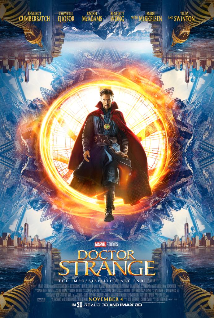
Thankfully, this poster actually focuses on the mind-bending tone of the movie and its titular hero, rather than jumbling all of the characters into a big, overcrowded mess.
Grade: A-
Kong? Check. Skull? Check. As a teaser poster, this does pretty well.
Grade: B+
The awkward photoshop in this poster is a little cringeworthy, but the real sad thing is that this popular book series is being made into a movie coming next month and no one had no idea until now. Somehow this has become even worse than the typical mediocre YA popcorn flick that you would expect from Maximum Ride.
Grade: D
It's a pretty unique method of visualizing the complex relationship dynamics in the film. Who needs photoshop when you can just use people?
Grade: A-
So I get that when you have Matt Damon in a film you need to show off his face (The Martian and Jason Bourne proved that), but in this case, the poster makes you really wish that you could see more of the titular Great Wall (and whatever those explosions are) in the background.
(Also, that doesn't even look like Matt Damon whatsoever, so major fail.)
Grade: C+
Which of these posters is your favorite? Tell me in the comments, and feel free to subscribe.


/cdn0.vox-cdn.com/uploads/chorus_asset/file/6770851/Bojack_S3_1sht_US.jpg)

