Every Friday, we're taking a look at the film and television posters released over the past week. Enjoy!
It's beautiful and exactly what you would expect from a documentary about the Earth.
Grade: B+
At this point, it's nearly impossible for American Horror Story to make anything creepier than their previous posters.
Grade: B-
A bunch of dramatic poses slapped together with an "exciting" tagline. Sigh.
Grade: C
Rarely do we see a poster choose to use so much blank space. Instead of the film's stars front-and-center in some romantic pose, we get something more quiet, and more telling.
Grade: A-
Which of these posters is your favorite? Tell me in the comments, and feel free to subscribe.
Every Friday, we're taking a look at the film and television posters released over the past week. Enjoy!
This poster is very successful at telling you the basic premise of the film, but it doesn't demonstrate any kind of impressive artistic creativity.
Grade: B-
The inspirational faces in the center are nothing new, but the orange hue adds a certain aesthetic. Incorporating the chess pattern was an obvious choice given the film's topic, and it's done in a pretty creative way.
Grade: B+
Arrival chose a pretty neat poster campaign, showing an ominous, slablike alien vessels in various locations around the world. Aside from an accidental controversy, it works out well.
Grade: B+
Pretty much exactly the kind of ridiculous action you'd expect.
Grade: B-
Which of these posters is your favorite? Tell me in the comments, and feel free to subscribe.
Every Friday, we're taking a look at the film and television posters released over the past week. Enjoy!
So you've got the titular hero with some interesting tones and blotches over the New York skyline. Could be better, but good enough.
Grade: B
There's something really weird going on in this poster, and even if it's difficult to interpret, you can't deny the unique artistic style.
Grade: A
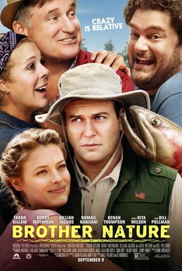
Clearly this designer thinks that a bunch of zany faces photoshopped next to each other is enough to qualify as a "good" poster. Sorry!
Grade: C
I guess someone decided that Milla Jovovich didn't look badass enough on her own so they put a ring of fire around her.
Grade: B-
Okay so let's get this straight: someone literally stitched six character posters together, put a banner in the middle, and called it good. Not cool.
Grade: C-
The magazine ad style is cool and unique, but there's so much stuff to read that your mind tends to not even bother trying.
Grade: B-
Which of these posters is your favorite? Tell me in the comments, and feel free to subscribe.
Every Friday, we're taking a look at the film and television posters released over the past week. Enjoy!
Clearly, this poster would rather have you read about how great the movie is than actually see the main characters without squinting your eyes.
Grade: C
It's creepy, but not in an especially creative way.
Grade: A-
So there's smoke and fiery and some distant destruction and Mark Wahlberg brooding with some dirt on his face. At least there's a hint of something artistic in there.
Grade: C+
American Horror Story continues to deliver some skin-crawling creepiness in its latest poster.
Grade: B+
What do you think of these posters? Tell me in the comments, and feel free to subscribe.
Every Friday, we're taking a look at the film and television posters released over the past week. Enjoy!
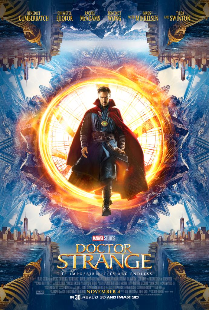
Thankfully, this poster actually focuses on the mind-bending tone of the movie and its titular hero, rather than jumbling all of the characters into a big, overcrowded mess.
Grade: A-
Kong? Check. Skull? Check. As a teaser poster, this does pretty well.
Grade: B+
The awkward photoshop in this poster is a little cringeworthy, but the real sad thing is that this popular book series is being made into a movie coming next month and no one had no idea until now. Somehow this has become even worse than the typical mediocre YA popcorn flick that you would expect from Maximum Ride.
Grade: D
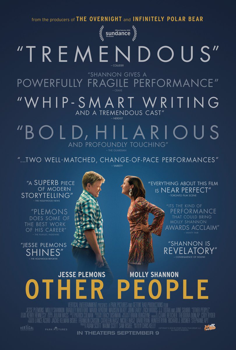
It's a pretty unique method of visualizing the complex relationship dynamics in the film. Who needs photoshop when you can just use people?
Grade: A-
So I get that when you have Matt Damon in a film you need to show off his face (The Martian and Jason Bourne proved that), but in this case, the poster makes you really wish that you could see more of the titular Great Wall (and whatever those explosions are) in the background.
(Also, that doesn't even look like Matt Damon whatsoever, so major fail.)
Grade: C+
Which of these posters is your favorite? Tell me in the comments, and feel free to subscribe.
Every Friday, we're taking a look at the film and television posters released over the past week. Enjoy!
The colors are a bit dull but it still succeeds in creating an air of mystery.
Grade: B+
It looks good enough, but you'd think they could come up with a more creative use of the traintrack motif.
Horror movie posters really like the color red. At least this one tries something new and unique with the silhouette and dirty smudges.
Grade: A-
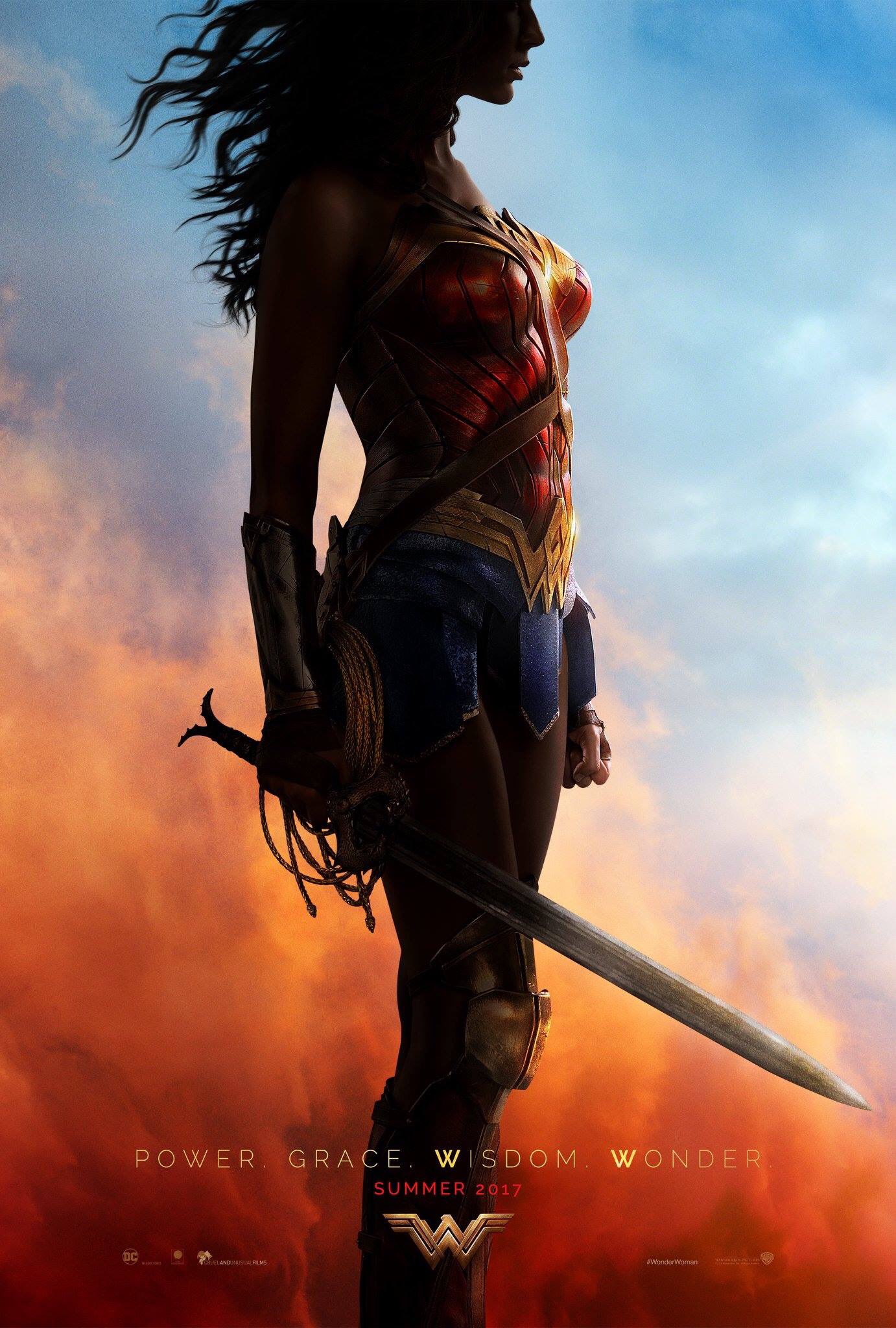
The heroine herself and her costume are nothing new, but the natural, vibrant colors promise something better than the bleak tones we saw in Batman v Superman.
Which of these posters is your favorite? Tell me in the comments, and feel free to subscribe.
Every Friday, we're taking a look at the film and television posters released over the past week. Enjoy!
Skulls. Zombies. How creative.
Grade: B-
It's simple humor, but it works.
Grade: B
At first glance, it's a retro poster for a new horror movie. Then you realize it's something much worse...
Grade: B-
A good character poster tells you something more about the character than just their name and the actor who plays them. So based on that, this poster is pretty boring.
Grade: C
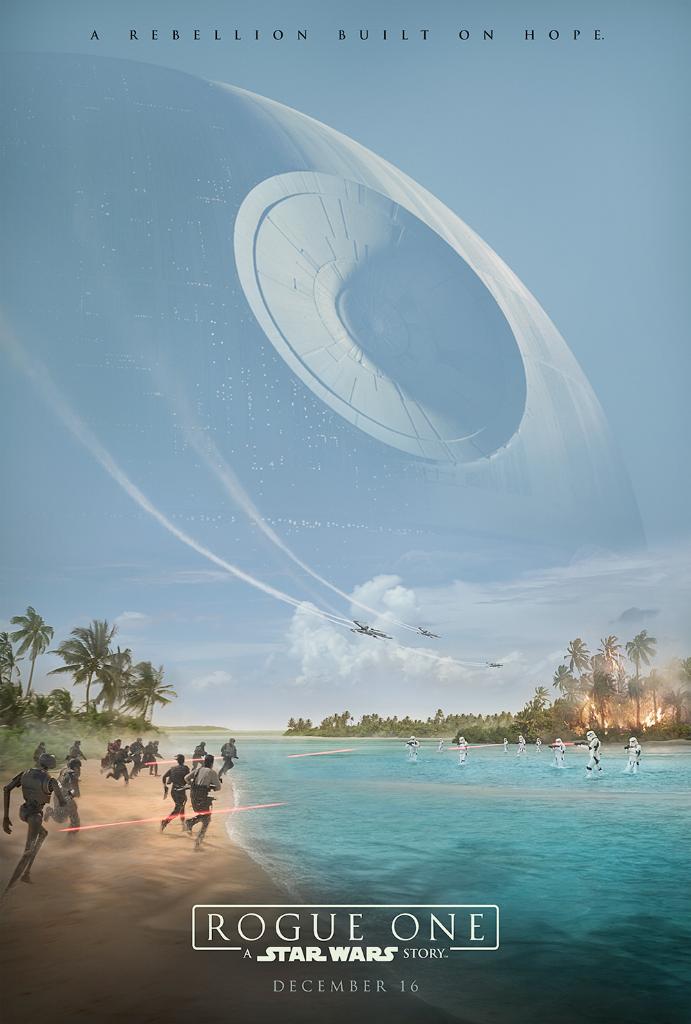
Not only is this poster visually beautiful, but it also does something that no Star Wars poster has done before: it focuses on the larger scheme of the film rather than the specific characters. No hint of Struzan influence – at least, not yet.
Grade: A
Which of these posters is your favorite? Tell me in the comments, and feel free to subscribe.
 It's beautiful and exactly what you would expect from a documentary about the Earth.
 At this point, it's nearly impossible for American Horror Story to make anything creepier than their previous posters.
 A bunch of dramatic poses slapped together with an "exciting" tagline. Sigh.
 Rarely do we see a poster choose to use so much blank space. Instead of the film's stars front-and-center in some romantic pose, we get something more quiet, and more telling.


/cdn0.vox-cdn.com/uploads/chorus_asset/file/6770851/Bojack_S3_1sht_US.jpg)

