Friday, March 25, 2016

Weekly Roundup #7

Every Friday, we're taking a look at the film and television posters released over the past week. Enjoy! 
This is reminiscent of the classic poster for Jaws, just at a different angle, and it can't be a coincidence since The Shallows also involves a great white shark attack.
The four main clones (plus the sheep mask of a fifth) are shown to be different, yet connected by the inkblot formation around them. This poster was actually created by graphic artist Jeff Langevin, who won a poster design contest for Season 4 of Orphan Black.
There's a billion ways to parody Barack Obama's iconic "Hope" campaign poster, but rather than an obvious choice like "Nope" or "Doom", Veep chooses a word that inspires both hope and doubt, quite possibly reflecting the tone of the next season. 
You wouldn't expect anything that can be described as "A PlayStation Original Series" to be any good, and you would probably be right, but this poster utilizes an enthralling 3D effect...although it makes the lettering kinda hard to read. 
It's never good when a sequel is made only because its predecessor's box office sum made up for its nasty critical reception, but at least it gave an opportunity for artist Dave Quibble to pay an homage to the classic comic covers. 

Which poster is your favorite? Tell me in the comments, and feel free to subscribe. 

Friday, March 18, 2016

Weekly Roundup #6

Every Friday, we're taking a look at the film and television posters released over the past week. Enjoy! 
Chances are, this horror movie will enter theaters unnoticed and most audiences will never know it exists. But this poster – brilliantly creating a woman's face out of leaves – might be enough to make They're Watching memorable.
This, ladies and gentlemen, is the epitome of the basic action/fantasy/sci-fi movie poster. Two main characters front-and-center with a sword dramatically dividing them; a few side-characters posing underneath; the only female character wearing a hilariously impractical breastplate (and not much else); and legions of indistinguishable, CGI soldiers at the bottom. 
We typically ignore fanmade posters on this blog, but this is a great example of unofficial art done right. Instead of the usual awkward, poorly-photoshopped mess (like this one), this poster mashes together various pieces of official promo art, resulting in all of the (many, many) superheroes looking their best. And the grainy, retro style reflects Captain America's old-fashioned nature. 
Okay, I don't really know what High-Rise is about, and this latest poster does nothing to help (unless it's subtly reflecting the mental state of Tom Hiddleston's character), but the marketing team has really gone all out with the poster campaign. 
At least this action hero has an excuse for running around shirtless all the time. The tagline isn't great, but it's certainly appropriate and pretty unique, too. 

Which poster is your favorite? Tell me in the comments, and feel free to subscribe. 

Friday, March 11, 2016

Weekly Roundup #5

Every Friday, we're taking a look at the film and television posters released over the past week. Enjoy! 
(Note: apologies for the abundance of superhero posters, these things just happen.) 
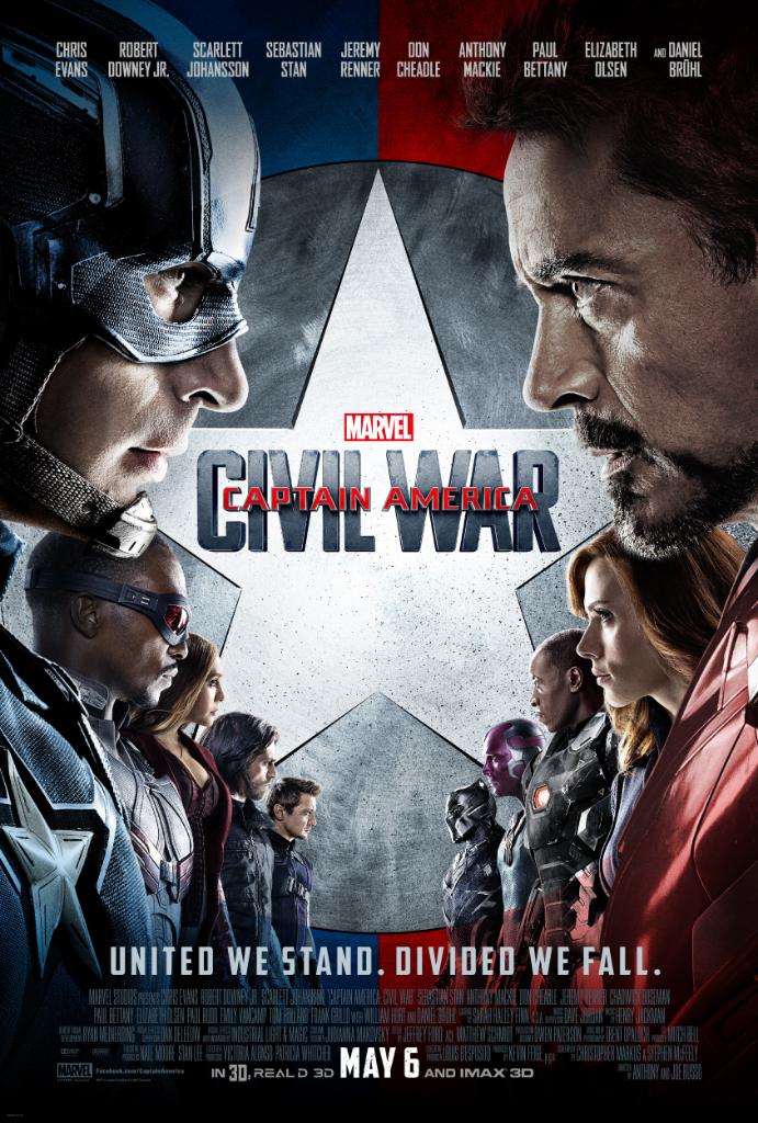
First of all, props for going a different route than the usual Marvel poster consisting of dozens of disembodied heads and various characters posing. This is a pretty well-made poster than instantly tells you what the movie is about. However, shame on them for excluding Paul Rudd's Ant-Man just to make Team Cap and Team Iron Man line up nice and symmetrical. (Also, bonus points for creating a unique tagline, instead of the predictable "Who's side are you on?" from the comics and the fanmade posters.)
Okay, X-Men: Apocalypse has a great director and great actors and great characters and (presumably) great special effects...but taglines are not its strong suit. "Destroy" and "Defend"? Really?
A key quality of any poster is that it doesn't give away too much of the plot, so Daredevil's marketing team may have made a bad move by spoiling the Punisher's and Elektra's comics-accurate costumes in this poster (even if those costumes happen to look awesome). Though to be fair, the Season 1 posters spoiled Daredevil's costume which he didn't even get until the last episode, so I guess that's just their style. 
Nice job trying the whole "recreate a classic comic cover" thing, but I'm pretty sure comic covers don't use photoshop (just look at Melissa Benoist's face). Not to mention that all of the guys in the background have totally random and/or WTF faces.
This poster shows us several new undersea creatures while maintaining the zany, crowded tone of Finding Nemo

Which poster is your favorite? Tell me in the comments, and feel free to subscribe. 
Tuesday, March 8, 2016

Spotlight: "Zootopia"

Zootopia, Disney's latest animated blockbuster/critical darling opened in theaters last weekend, and I thought I'd take the opportunity to showcase the movie's expert use of the "parody poster."
Nice Disney synergy. 
Bonus points for parodying all of those names. (I'd really like to meet the group of people who spent hours coming up with animal-related puns.) 
Which poster is your favorite? Tell me in the comments, and feel free to subscribe. 

Friday, March 4, 2016

Weekly Roundup #4

Every Friday, we're taking a look at the film and television posters released over the past week. Enjoy! 
High-Rise continues to use a cool kaleidoscope effect on these character posters. 
A woman trapped in a mailbox? A creepy empty house? Subdued colors? This has all the makings of a horror movie poster. (Though it makes you wonder why someone would buy a house on Cloverfield Lane.) 
You know things are bad when the clouds form a skull. And no, unfortunately that isn't the Dark Mark and there's no Harry Potter crossover coming.

Which poster is your favorite? Tell me in the comments, and feel free to subscribe.