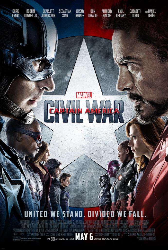
Every Friday, we're taking a look at the film and television posters released over the past week. Enjoy!
(Note: apologies for the abundance of superhero posters, these things just happen.)
First of all, props for going a different route than the usual Marvel poster consisting of dozens of disembodied heads and various characters posing. This is a pretty well-made poster than instantly tells you what the movie is about. However, shame on them for excluding Paul Rudd's Ant-Man just to make Team Cap and Team Iron Man line up nice and symmetrical. (Also, bonus points for creating a unique tagline, instead of the predictable "Who's side are you on?" from the comics and the fanmade posters.)
Okay, X-Men: Apocalypse has a great director and great actors and great characters and (presumably) great special effects...but taglines are not its strong suit. "Destroy" and "Defend"? Really?
A key quality of any poster is that it doesn't give away too much of the plot, so Daredevil's marketing team may have made a bad move by spoiling the Punisher's and Elektra's comics-accurate costumes in this poster (even if those costumes happen to look awesome). Though to be fair, the Season 1 posters spoiled Daredevil's costume which he didn't even get until the last episode, so I guess that's just their style.
Nice job trying the whole "recreate a classic comic cover" thing, but I'm pretty sure comic covers don't use photoshop (just look at Melissa Benoist's face). Not to mention that all of the guys in the background have totally random and/or WTF faces.
This poster shows us several new undersea creatures while maintaining the zany, crowded tone of Finding Nemo.
Which poster is your favorite? Tell me in the comments, and feel free to subscribe.
(Note: apologies for the abundance of superhero posters, these things just happen.)
Okay, X-Men: Apocalypse has a great director and great actors and great characters and (presumably) great special effects...but taglines are not its strong suit. "Destroy" and "Defend"? Really?
A key quality of any poster is that it doesn't give away too much of the plot, so Daredevil's marketing team may have made a bad move by spoiling the Punisher's and Elektra's comics-accurate costumes in this poster (even if those costumes happen to look awesome). Though to be fair, the Season 1 posters spoiled Daredevil's costume which he didn't even get until the last episode, so I guess that's just their style.
Nice job trying the whole "recreate a classic comic cover" thing, but I'm pretty sure comic covers don't use photoshop (just look at Melissa Benoist's face). Not to mention that all of the guys in the background have totally random and/or WTF faces.
This poster shows us several new undersea creatures while maintaining the zany, crowded tone of Finding Nemo.
Which poster is your favorite? Tell me in the comments, and feel free to subscribe.


No comments:
Post a Comment