Every Friday, we're taking a look at the most notable film and television posters released over the past week. Enjoy!
The blue and purple colors are definitely cool to look at, but they fail to symbolize anything or tell us something about the film. It's falling into the trap of "artsy for the sake of being artsy."
Grade: B
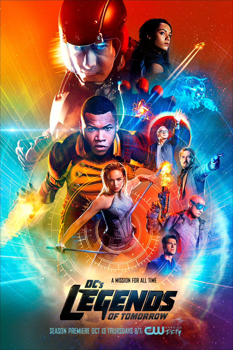
This surreal, trippy poster seems to totally capture the series' tone. It's not complex, but it still invites you to really study it for a while.
Grade: A-
Okay...so the movie is called Fantastic Beasts and it chooses four pretty un-fantastic humans to put on its poster, with a couple of buildings as a backdrop. Did no one think of splicing some magical creature onto the empty top third of the poster just to liven things up a bit? More like Group Shots and Where to Find Them.
Grade: C+
Between the text, the crappy Photoshop, and the uncreatie tagline, this poster simply reeks of mediocrity.
Grade: C-
Which of these posters is your favorite? Tell me in the comments, and feel free to subscribe.
Every Friday, we're taking a look at the most notable film and television posters released over the past week. Enjoy!
It's a different style than you would expect for a movie poster, something weird and a little creepy and pretty unique.
Grade: A-
Just like John Wick itself, this poster is a classier spin on the typical secret agent / spy / hitman movie.
Grade: B+
The tagline is pretty stupid and this poster isn't especially creative, but at least it's at a different angle than usual?
Grade: C+
The color and vibrancy of this poster actually makes up for all the overcrowded characters.
Grade: B+
This is an incredibly unique style of poster, looking very much like a mashup of three real, hand-drawn pieces.
Which of these posters is your favorite? Tell me in the comments, and feel free to subscribe.
Every Friday, we're taking a look at the most notable film and television posters released over the past week. Enjoy!
It's a creepy – and pretty captivating – twist on a church mural.
Grade: B+
Ummm...since when did people watch Fifty Shades of Grey movies to see people put clothes on each other? In any case, it's an acceptable (although inexplicable) teaser poster.
Grade: B
It's not a bad poster, but it's exactly the kind of colorful imagery and quirky characters that you would expect from a Disney movie.
Grade: B+
No matter which way you look at it, there's no denying that this looks more like an animated video game character than an actual person.
This impressive poster uses only a few colors (drawing attention to Chastain's hair) and contrasts them in a pretty interesting way.
Grade: A-
The rivers will indeed flow red with blood. Designed like an old-fashioned painting, this poster tells us exactly what the movie is about.
Grade: A-
Not sure whether it's the colors, awkward running poses, kinda crappy Photoshop, upside-down skyline. or title placement, but something about this poster is odd. And not in a good way.
Which of these posters is your favorite? Tell me in the comments, and feel free to subscribe.
Every Friday, we're taking a look at the film and television posters released over the past week. Enjoy!
It doesn't seem incredibly creative, but when the entire plot and box office of a film center on its two A-list stars, it's not a bad idea to slap some cool, sci-fi reflections on their attractive faces, put some sleek text in-between, and call it a teaser poster.
Grade: B+
Wow. For such an unappealing, soon-to-be-forgettable film, this is a pretty darn great poster. The cartoon-y style that simultaneously explains the premise of the movie is miles ahead of the earlier posters.
Grade: A-
This one's a little more quiet, a little more subtle, but still just as artistic and original.
Grade: A-
Sure, these character posters are maintaining the "peculiar" theme of the rest of the film's marketing, but is it actually that interesting or appealing anymore?
Grade: B
This torn paper design is a pretty cool idea for a character poster, even if you have to do a little research to figure out why it's relevant to the film's plot.
Grade: B+
The poster reflects its tagline; the dulled colors represent the hope of the American dream, while the darkness cast on Affleck's represents its "price." (Sidenote: you'd think that after Batman v Superman, we'd all have grown tired of Ben Affleck looking grim and sad.)
Grade: A-
Which of these posters is your favorite? Tell me in the comments, and feel free to subscribe.
Every Friday, we're taking a look at the film and television posters released over the past week. Enjoy!
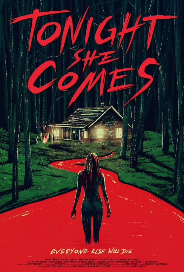
It's artistic and symmetrical and creepy and it looks pretty darn good.
Grade: A
Overall it's a very generic, uncreative poster with some slightly-cringeworthy photoshop going on.
Grade: C
The mosaic style is actually done pretty well in this case, even if it's unclear why it's being used in the first place.
Grade: B+
It's not really a creative concept for a poster, but it still conveys the general tone of the movie and looks like a mostly compelling action-comedy.
Grade: B
For an exciting movie with an impressive cast, this is a pretty boring poster. I mean, I understand the challenges of fitting seven characters into one poster, but still, you'd think they could have come up with something better.
Grade: B-
It's an eye-catching, creepy twist on Da Vinci's famous Vitruvian Man. Looking at this poster, you have no idea why a bald semi-skeleton is trapped in this ring, but you want to know more. And that's really what a poster is supposed to do.
Grade: A-
Which of these posters is your favorite? Tell me in the comments, and feel free to subscribe.


