Every Friday, we're taking a look at the most notable film and television posters released over the past week. Enjoy!
It's a creepy – and pretty captivating – twist on a church mural.
Grade: B+
Ummm...since when did people watch Fifty Shades of Grey movies to see people put clothes on each other? In any case, it's an acceptable (although inexplicable) teaser poster.
Grade: B
It's not a bad poster, but it's exactly the kind of colorful imagery and quirky characters that you would expect from a Disney movie.
Grade: B+
No matter which way you look at it, there's no denying that this looks more like an animated video game character than an actual person.
This impressive poster uses only a few colors (drawing attention to Chastain's hair) and contrasts them in a pretty interesting way.
Grade: A-
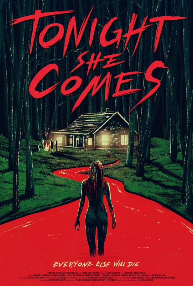
The rivers will indeed flow red with blood. Designed like an old-fashioned painting, this poster tells us exactly what the movie is about.
Grade: A-
Not sure whether it's the colors, awkward running poses, kinda crappy Photoshop, upside-down skyline. or title placement, but something about this poster is odd. And not in a good way.
Which of these posters is your favorite? Tell me in the comments, and feel free to subscribe.

No comments:
Post a Comment