Every Friday, we're taking a look at the most notable film and television posters released over the past week. Enjoy!
It's a fairly simple poster that blends two foregrounds together to show us a troubled woman and a man who visibly has some kind of presence in her mind.
Grade: A-
It's not a particularly creative idea for a poster, but it succeeds in explaining the film's premise without too much effort.
Grade: B
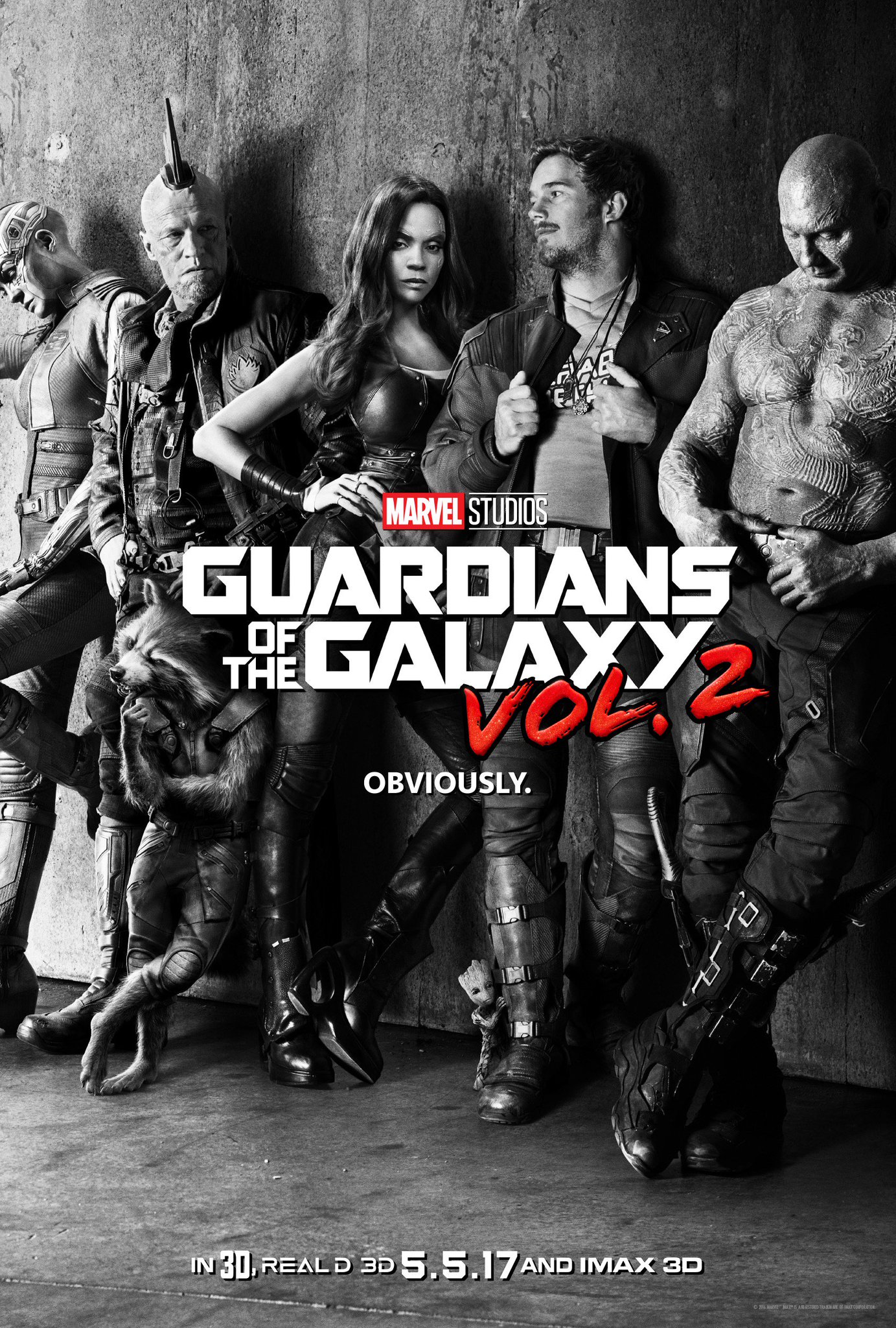
Between the unusual black-and-white style, "cool kid" poses, and in-your-face tagline, this poster oozes with confidence. It gives us off the attitude of "We know how much everyone's been looking forward to this sequel," and it's correct.
Grade: A-
This poster has a little bit of a weird structure, since it puts all of the actor's faces on the right side and draws your eyes away from the alien spacecraft on the left. Maybe it's intentional, maybe it's not. In any case, there's still imagery to admire here.
Grade: B+
What do you think of these posters? Tell me in the comments, and feel free to subscribe.
Grade: A-
It's not a particularly creative idea for a poster, but it succeeds in explaining the film's premise without too much effort.
Grade: B
Between the unusual black-and-white style, "cool kid" poses, and in-your-face tagline, this poster oozes with confidence. It gives us off the attitude of "We know how much everyone's been looking forward to this sequel," and it's correct.
Grade: A-
This poster has a little bit of a weird structure, since it puts all of the actor's faces on the right side and draws your eyes away from the alien spacecraft on the left. Maybe it's intentional, maybe it's not. In any case, there's still imagery to admire here.
Grade: B+
What do you think of these posters? Tell me in the comments, and feel free to subscribe.

No comments:
Post a Comment