Every Friday, we're taking a look at the most notable film and television posters released over the past week. Enjoy!
There's definitely something very creepy about this black-and-white poster, although it looks more like a poster for a horror movie than a British miniseries.
Grade: B+
This international poster isn't too bad, but there's something a little weird about the character's profiles overlapping each other like that and leaving so much negative space on the outside.
Grade: B-
Everything about this poster is just kinda awful. Sorry.
Grade: D+
There's something very colorful and cartoon-y about this poster. It teases King Kong from afar rather than revealing him in all his glory.
Grade: A-
Which of these posters is your favorite? Tell me in the comments, and feel free to subscribe.
Every Friday, we're taking a look at the most notable film and television posters released over the past week. Enjoy!
There's definitely something pretty creepy about this poster. It has a distinct graininess and uses a soft yellow color than the blood red that you would expect.
Grade: B+
The overlapping faces and bodies in this poster are pretty cool, although they leave a lot of awkward white space on the outside.
Grade: B
The middle portion of this poster is certainly beautiful, but it's almost ruined by the cluttered names at the top.
Grade: B+
What do you think of these posters? Tell me in the comments, and feel free to subscribe.
Every Friday, we're taking a look at the most notable film and television posters released over the past week. Enjoy!
These character posters actually have something artistic going on with the watercolor-like strokes in the center.
Grade: B+
This poster opts for a candid style, promising some rowdy partying and holiday fun. Not too bad.
Grade: B
The color here is nice, but with the World War I setting and all, you'd think they could have come up with something a little more creative. Oh well, maybe in the theatrical poster.
Grade: B+
Yes, you can put Jennifer Lawrence's and Chris Pratt's faces front-and-center with some stars and a space station below, and call it good advertising that accurately represents the film's plot. But couldn't they think of something better, like incorporating the actors' faces directly in the cosmos?
Grade: B
Which of these posters is your favorite? Tell me in the comments, and feel free to subscribe.
Every Friday, we're taking a look at the most notable film and television posters released over the past week. Enjoy!
It's got a pretty obvious 1950s feel and it shows us the film's basic premise in a very simple way. This poster and its two alternative versions are all recreations of real-life photographs of the couple.
Grade: B
It's a very simple poster that shows two people who are clearly in love, but separated by forces beyond their control. It's not very creative, but it works.
Grade: B
This poster is a piece of true art, with dramatic poses and disembodied heads and something a little sinister going on. If only all movie posters could be like this...
Grade: A-
The neon art is instantly evocative of the film's title, even without knowing anything about the plot.
Grade: A
So someone at Marvel made a poster out of emojis...and it's actually pretty good. Like, seriously, the color and detail and pure fun of this poster make it better than the film's previous posters (y'know, the ones with real humans on them) in several ways.
Grade: A-
Which of these posters is your favorite? Tell me in the comments, and feel free to subscribe.
Every Friday, we're taking a look at the most notable film and television posters released over the past week. Enjoy!

It's a fairly simple poster that blends two foregrounds together to show us a troubled woman and a man who visibly has some kind of presence in her mind.
Grade: A-
It's not a particularly creative idea for a poster, but it succeeds in explaining the film's premise without too much effort.
Grade: B
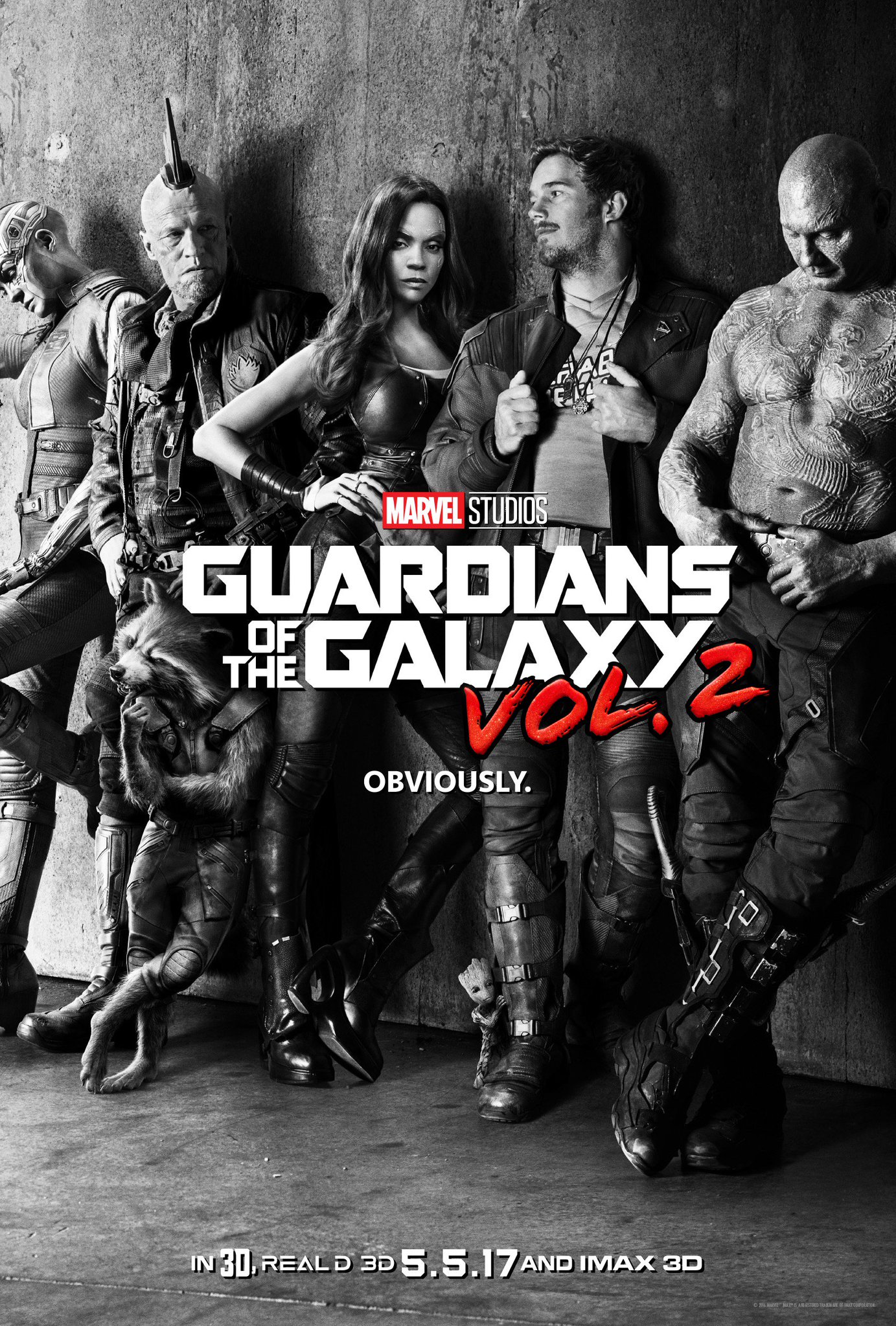
Between the unusual black-and-white style, "cool kid" poses, and in-your-face tagline, this poster oozes with confidence. It gives us off the attitude of "We know how much everyone's been looking forward to this sequel," and it's correct.
Grade: A-
This poster has a little bit of a weird structure, since it puts all of the actor's faces on the right side and draws your eyes away from the alien spacecraft on the left. Maybe it's intentional, maybe it's not. In any case, there's still imagery to admire here.
Grade: B+
What do you think of these posters? Tell me in the comments, and feel free to subscribe.
Every Friday, we're taking a look at the most notable film and television posters released over the past week. Enjoy!
This new take on the typical "lone hitman" poster has our hero in a hilariously unfortunate position. It tells us that if you liked seeing people shoot at Keanu Reeves in the first John Wick, then you'll like the sequel.
Grade: A-
It's colorful, enthralling, and it conveys the show's basic premise of combining futuristic technology with the Wild West.
Grade: A-
This gorgeous poster has the general Star Wars feel, with the disproportionate bodies and disembodied faces, but it doesn't feel overly crowded.
Grade: A
These retro "target practice" posters give us a great 70s vibe with some cool neon colors.
Grade: A-
It's a cool way of showing many different characters (and famous stars) at once, but it's also a little frustrating since it tells you nothing about the actual plot (or even premise) of the film.
Grade: B+
Which of these posters is your favorite? Tell me in the comments, and feel free to subscribe.
Every Friday, we're taking a look at the most notable film and television posters released over the past week. Enjoy!
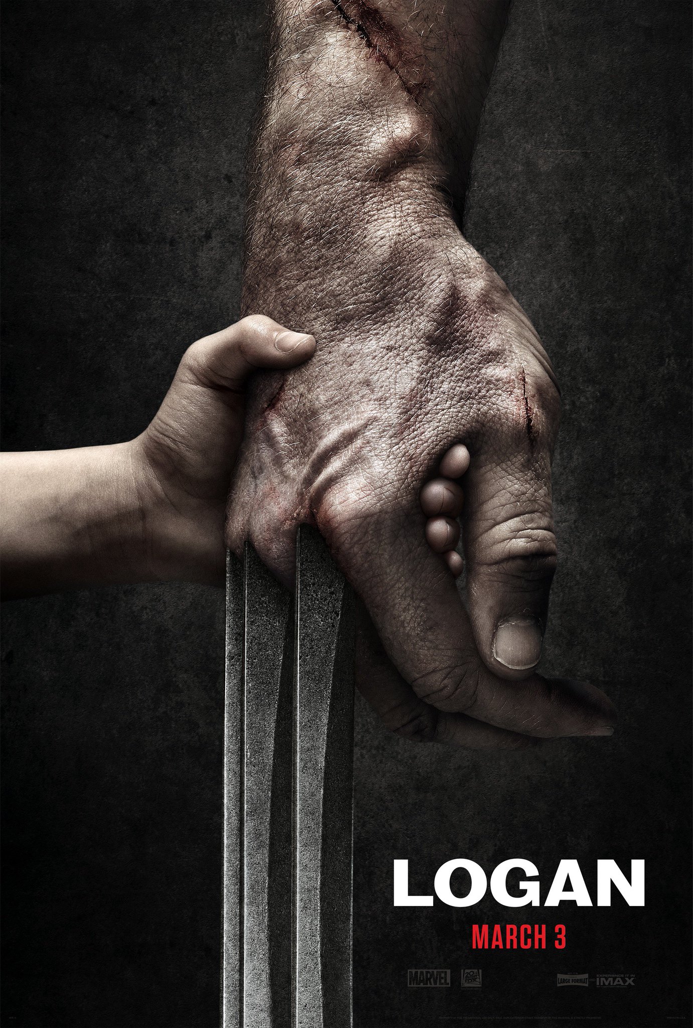
Kind of exactly what you would expect from a teaser poster for a Wolverine movie. There's nothing especially bad about it, and the child's hand certainly adds a degree of mystery, but it definitely could have been more creative.
Grade: B-
This is such a nice, simple poster that sticks to an eye-catching color scheme. Also notice the large title text that's probably modeled after Jacqueline Kennedy's real signature, which is something biographical films don't really do too often.
Grade: A-
Believe it or not, a creepy skeleton dipped in gold isn't actually that more interesting than a regular skeleton. Meh.
Grade: B-
A pretty effective teaser poster that showcases more of the film's general intergalactic theme than its characters or plot.
Grade: B+
Which of these posters is your favorite? Tell me in the comments, and feel free to subscribe.


 This international poster isn't too bad, but there's something a little weird about the character's profiles overlapping each other like that and leaving so much negative space on the outside.
 Everything about this poster is just kinda awful. Sorry.
 There's something very colorful and cartoon-y about this poster. It teases King Kong from afar rather than revealing him in all his glory.