Every Friday, we're taking a look at the most notable film and television posters released over the past week. Enjoy!
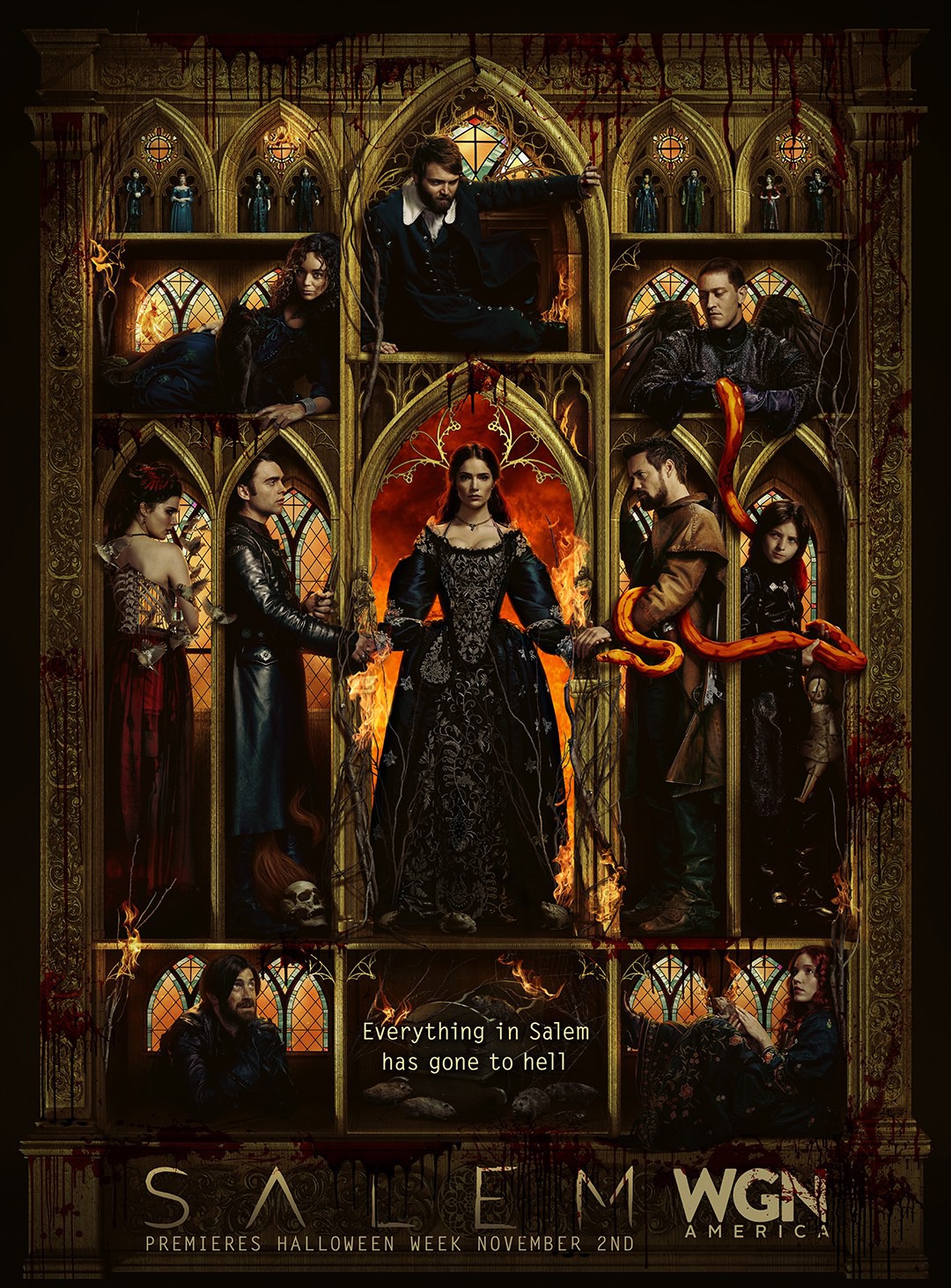
It's a creepy – and pretty captivating – twist on a church mural.
Grade: B+
Ummm...since when did people watch Fifty Shades of Grey movies to see people put clothes on each other? In any case, it's an acceptable (although inexplicable) teaser poster.
Grade: B
It's not a bad poster, but it's exactly the kind of colorful imagery and quirky characters that you would expect from a Disney movie.
Grade: B+
No matter which way you look at it, there's no denying that this looks more like an animated video game character than an actual person.
This impressive poster uses only a few colors (drawing attention to Chastain's hair) and contrasts them in a pretty interesting way.
Grade: A-
The rivers will indeed flow red with blood. Designed like an old-fashioned painting, this poster tells us exactly what the movie is about.
Grade: A-
Not sure whether it's the colors, awkward running poses, kinda crappy Photoshop, upside-down skyline. or title placement, but something about this poster is odd. And not in a good way.
Which of these posters is your favorite? Tell me in the comments, and feel free to subscribe.
Every Friday, we're taking a look at the film and television posters released over the past week. Enjoy!
It doesn't seem incredibly creative, but when the entire plot and box office of a film center on its two A-list stars, it's not a bad idea to slap some cool, sci-fi reflections on their attractive faces, put some sleek text in-between, and call it a teaser poster.
Grade: B+
Wow. For such an unappealing, soon-to-be-forgettable film, this is a pretty darn great poster. The cartoon-y style that simultaneously explains the premise of the movie is miles ahead of the earlier posters.
Grade: A-
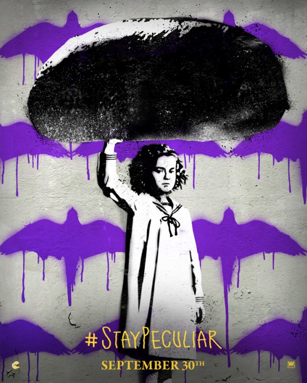
This one's a little more quiet, a little more subtle, but still just as artistic and original.
Grade: A-
Sure, these character posters are maintaining the "peculiar" theme of the rest of the film's marketing, but is it actually that interesting or appealing anymore?
Grade: B
This torn paper design is a pretty cool idea for a character poster, even if you have to do a little research to figure out why it's relevant to the film's plot.
Grade: B+
The poster reflects its tagline; the dulled colors represent the hope of the American dream, while the darkness cast on Affleck's represents its "price." (Sidenote: you'd think that after Batman v Superman, we'd all have grown tired of Ben Affleck looking grim and sad.)
Grade: A-
Which of these posters is your favorite? Tell me in the comments, and feel free to subscribe.
Every Friday, we're taking a look at the film and television posters released over the past week. Enjoy!
It's artistic and symmetrical and creepy and it looks pretty darn good.
Grade: A
Overall it's a very generic, uncreative poster with some slightly-cringeworthy photoshop going on.
Grade: C
The mosaic style is actually done pretty well in this case, even if it's unclear why it's being used in the first place.
Grade: B+
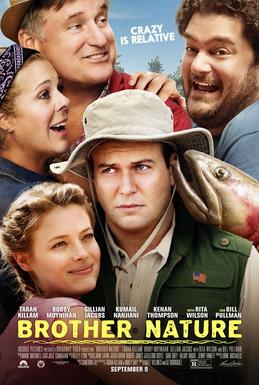
It's not really a creative concept for a poster, but it still conveys the general tone of the movie and looks like a mostly compelling action-comedy.
Grade: B
For an exciting movie with an impressive cast, this is a pretty boring poster. I mean, I understand the challenges of fitting seven characters into one poster, but still, you'd think they could have come up with something better.
Grade: B-
It's an eye-catching, creepy twist on Da Vinci's famous Vitruvian Man. Looking at this poster, you have no idea why a bald semi-skeleton is trapped in this ring, but you want to know more. And that's really what a poster is supposed to do.
Grade: A-
Which of these posters is your favorite? Tell me in the comments, and feel free to subscribe.
Every Friday, we're taking a look at the film and television posters released over the past week. Enjoy!
It's beautiful and exactly what you would expect from a documentary about the Earth.
Grade: B+
At this point, it's nearly impossible for American Horror Story to make anything creepier than their previous posters.
Grade: B-
A bunch of dramatic poses slapped together with an "exciting" tagline. Sigh.
Grade: C
Rarely do we see a poster choose to use so much blank space. Instead of the film's stars front-and-center in some romantic pose, we get something more quiet, and more telling.
Grade: A-
Which of these posters is your favorite? Tell me in the comments, and feel free to subscribe.
Every Friday, we're taking a look at the film and television posters released over the past week. Enjoy!
This poster is very successful at telling you the basic premise of the film, but it doesn't demonstrate any kind of impressive artistic creativity.
Grade: B-
The inspirational faces in the center are nothing new, but the orange hue adds a certain aesthetic. Incorporating the chess pattern was an obvious choice given the film's topic, and it's done in a pretty creative way.
Grade: B+
Arrival chose a pretty neat poster campaign, showing an ominous, slablike alien vessels in various locations around the world. Aside from an accidental controversy, it works out well.
Grade: B+
Pretty much exactly the kind of ridiculous action you'd expect.
Grade: B-
Which of these posters is your favorite? Tell me in the comments, and feel free to subscribe.
Every Friday, we're taking a look at the film and television posters released over the past week. Enjoy!
So you've got the titular hero with some interesting tones and blotches over the New York skyline. Could be better, but good enough.
Grade: B
There's something really weird going on in this poster, and even if it's difficult to interpret, you can't deny the unique artistic style.
Grade: A
Clearly this designer thinks that a bunch of zany faces photoshopped next to each other is enough to qualify as a "good" poster. Sorry!
Grade: C
I guess someone decided that Milla Jovovich didn't look badass enough on her own so they put a ring of fire around her.
Grade: B-
Okay so let's get this straight: someone literally stitched six character posters together, put a banner in the middle, and called it good. Not cool.
Grade: C-
The magazine ad style is cool and unique, but there's so much stuff to read that your mind tends to not even bother trying.
Grade: B-
Which of these posters is your favorite? Tell me in the comments, and feel free to subscribe.
Every Friday, we're taking a look at the film and television posters released over the past week. Enjoy!
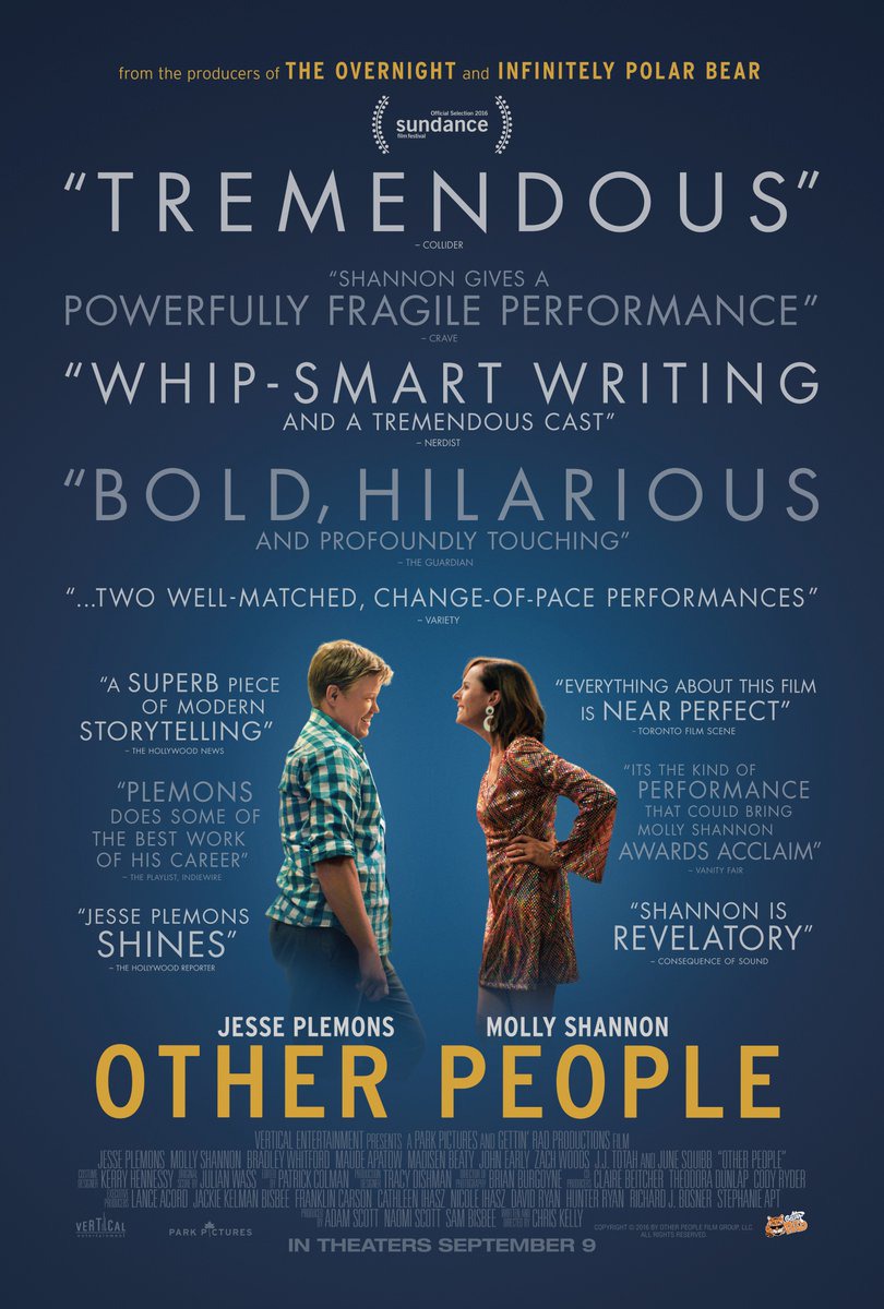
Clearly, this poster would rather have you read about how great the movie is than actually see the main characters without squinting your eyes.
Grade: C
It's creepy, but not in an especially creative way.
Grade: A-
So there's smoke and fiery and some distant destruction and Mark Wahlberg brooding with some dirt on his face. At least there's a hint of something artistic in there.
Grade: C+
American Horror Story continues to deliver some skin-crawling creepiness in its latest poster.
Grade: B+
What do you think of these posters? Tell me in the comments, and feel free to subscribe.
 It's a creepy – and pretty captivating – twist on a church mural.
 Ummm...since when did people watch Fifty Shades of Grey movies to see people put clothes on each other? In any case, it's an acceptable (although inexplicable) teaser poster.
 It's not a bad poster, but it's exactly the kind of colorful imagery and quirky characters that you would expect from a Disney movie.
  No matter which way you look at it, there's no denying that this looks more like an animated video game character than an actual person.
 This impressive poster uses only a few colors (drawing attention to Chastain's hair) and contrasts them in a pretty interesting way.
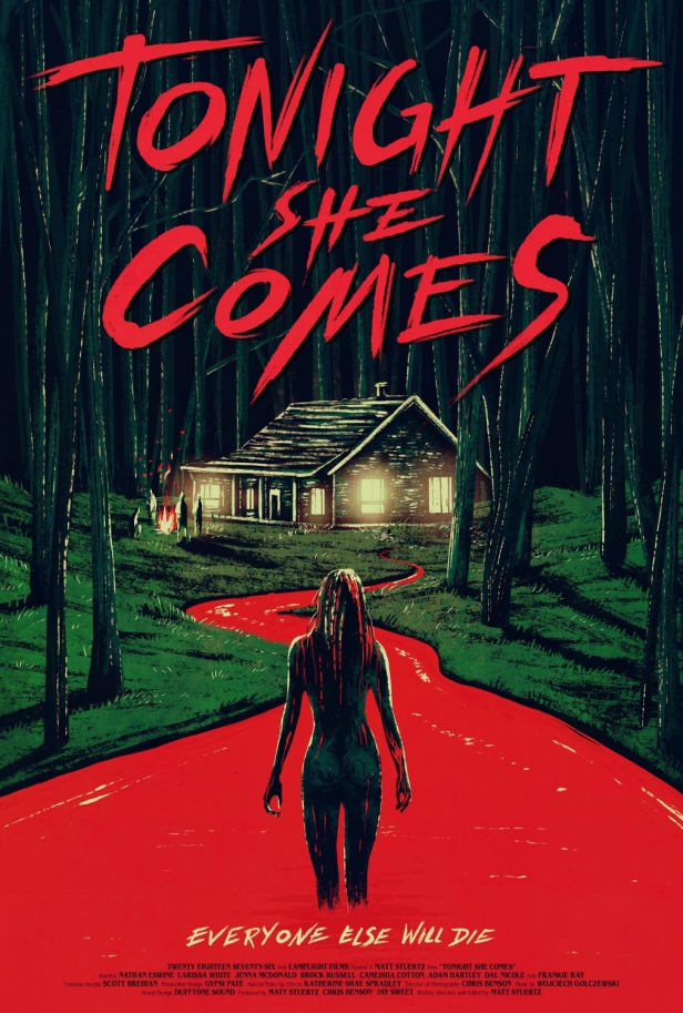 The rivers will indeed flow red with blood. Designed like an old-fashioned painting, this poster tells us exactly what the movie is about.
 Not sure whether it's the colors, awkward running poses, kinda crappy Photoshop, upside-down skyline. or title placement, but something about this poster is odd. And not in a good way.